
Needing help with online marketing?
UX: Does it Matter What You Should Have Above the Fold?
Share this post
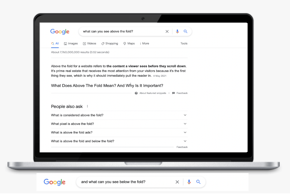
When looking for ways to improve your website’s user experience, you’ll probably come across the term “above the fold.” It may surprise you what this term means if you can’t see any folds on your site. The fact is websites do have folds that determine where content is placed.
“Above the fold” refers to the top web page part that visitors can see without scrolling. The term is widely used in the newspaper publishing world to describe the part of a newspaper that attracts customers. Publishers intentionally put all of their eye-catching vivid imagery and headlines on this part to improve readership.
The “above the fold” idea quickly found its way into the digital world to refer to the content displayed on the top part of a page. Content and website elements featured above the fold largely influence user experience and conversions. In this guide, we’ll show you how to find your site’s fold and how to make it a vital UX tool.
Does “Above the Fold” Still Matter?
The first impression your website makes to a visitor can determine whether they’ll take a desired action. Your site’s above-the-fold area acts like a landing page that should appeal to your visitors to keep them coming for more, and that’s why this section of a website still matters today.
New surveys on user experiences on websites suggest that people scroll more than they used to. While the above-the-fold area can make them interested in checking the website, the entire content has to be appealing for them to stay longer. Such surveys have led some website owners to question the importance of fold design on modern websites.
How people access the world wide web has changed over the years. It’s thus important to optimise the above-the-fold area to cater to your visitors’ browsing experiences. Put more attention to this section when designing your site to compel visitors to continue scrolling.
Where is the Above the Fold on Websites?
The exact measurements for a web page fold differ with the screen sizes and resolutions out there. However, most UX designers consider its measurements to be 1000 pixels in width and 600 pixels in height.
The average website fold stands at 800 pixels. It can be larger if the user’s screen is as wide as a large monitor or smaller if the screen is as small as a smartphone’s. Either way, base your site’s fold line on visitors’ screen size data derived from web analytics.
You should also consider how often your site’s visitors use mobile devices to access your site when determining the fold’s location. Your above-the-fold content should always be responsive for it to be featured across different internet-connected devices.
Effects of Above the Fold on User Experience
Your site’s above-the-fold area has a great effect on user experience. Visitors will read or view content on your site from the top going downwards.
The practice of adding advertising banners above the fold is increasingly losing traction. That’s because more users have begun ignoring this space. Instead of advertisements, placing useful information in this area can improve visitors’ engagement with your website.
Great user experience largely draws from the user base a website attracts. Refer to your web analytics for insights on how your site visitors engage with above-the-fold elements. Find out their likelihood of scrolling down the page.
Your site’s above the fold area should have enough prompters to let users know what’s below the fold. In the world of user experience, the fold serves as a conceptual line used to draw the user’s attention to a website. It won’t matter if your website lacks a great UX design.
Finding Your Fold
Heat maps can help you determine the exact location of folds on your website. They are tools that gather data from real-life website visitors and display the findings in different colors. Light blue showcases the least used sections, yellow suggests the averagely used sections, while dark red is for the most used website pieces.
Heat maps display areas of a website with the most hits. They also track where visitors are tapping or clicking on your site. You can use this data with analytical data to determine how long and how often visitors interact with web pages on your site.
5 Above the Fold Ideas for Better Conversions
It’s now clear that above-the-fold content is crucial when you want to attract visitors’ attention. The goal here is to keep them hooked on a page for them to check the rest of the information on the page. Here are five brilliant above-the-fold ideas for increased conversions on your site:
1. Optimise Each Content Element on Your Site
Your site’s above-the-fold content should be reserved for only high-priority information. Each content element should serve a specific purpose that relates to other content down the page.
Consider optimising content elements like the unique selling proposition (USP), primary copy, branding, and navigation. The site’s contact info and CTA should also be optimised to improve conversions.
The USP should inform your visitors about your offerings and their benefits, while the primary copy should give more details about the USP. Add branding elements like brand colors, font and logo above the fold to stand out from your competitors. You should also tweak the navigation features to allow visitors to find what they’re looking for on the site.
Remember to add your brand’s contact information to improve your credibility. Placing a CTA above the fold will draw visitors’ attention and improve the likelihood of conversions. For instance, you can use an ask for review template to add a banner that solicits people’s input if you want reviews on your site.
2. Eliminate All Distractions
The above-the-fold content should be the first point of interaction customers have with your brand. It should be memorable and distinct instead of scattered to draw people’s attention.
Cut out any fluff or unnecessary content on the above-the-fold section. Keep the content precise and unique to increase the likelihood of customers being interested in your offerings. The key here is to create a memorable experience to keep people hooked.
Placing all of your content on the top fold won’t help your site’s conversion rates. Instead, only put the most crucial content above the fold.
3. Make the Most out of Images
Create and deliver high-quality images in the right format, resolution and size to drive engagement. You should also accurately label the images for search engine crawlers to index them and decipher the web page context.
As you add aesthetic images on the top fold, be sure to prioritise your site’s load speeds. Images may take too long to load if your site’s load speed is low. As a result, visitors won’t likely deflect to your competitors’ sites for a solution to their needs.
Though large and heavy pictures may attract people’s attention, they may take a toll on the load speeds and UX. Experiment with different image resolutions to find one that works with your site’s load speeds.
4. Hook Visitors with the Heading and Primary Copy
Have a goal to guide you on which content to include on your site. The goal should reflect your sales funnel and the funnel stage your target customers are in.
For instance, if your customers are in the awareness stage, focus the heading on identifying a problem they all face. Use a common problem as the hook to your heading to engage visitors
Your primary copy should build on the heading to demonstrate why your offerings make customers’ lives better. It should be free of hype and easy to read and understand. Keep the message short, concise and persuasive to encourage visitors to take a specific action.
5. Make Mobile UX a Priority
You should always use a mobile-first approach in your web design activities. The padding for the top fold content must be customized for all screen sizes. That’s because more people are using handheld devices to access the Internet than ever.
Consider designing the mobile site with the target user in mind and employing proper mobile SEO strategies. The mobile site should feature a clear menu, search options and minimal toned-down fonts. You should also optimise it for speed and use labeled icons to convey information quickly.
Build a Website with Social Space Today
It’s no secret that the above the fold area is the most crucial part of a landing page. Adding it expertly to your site can attract attention and views. For it to generate more leads, analyses user behavior to understand how people interact with your site.
Count on Social Space for a newly designed website that will improve your search rankings. We help small businesses improve their online presence without web design strategies. Our services also encompass Google listing, Google Maps SEO and SEO.

About Social Space
Hey there, I'm Robert Tickner!
I’m an online visibility consultant who helps local small businesses get noticed on Google search, guiding them on their digital journey for growth. I build websites with structured web design practices through SEO services that get noticed on Google's search algorithms, write the occasional blog, and boost Google Business Profile listings to improve overall traffic that helps convert more potential clients to your website.
I'm determined to grow my business.
My only question, is it time to boost yours?
Categories covered
Resources
Resources